No products in the cart.
Google changes its Chrome logo for the first time in eight years
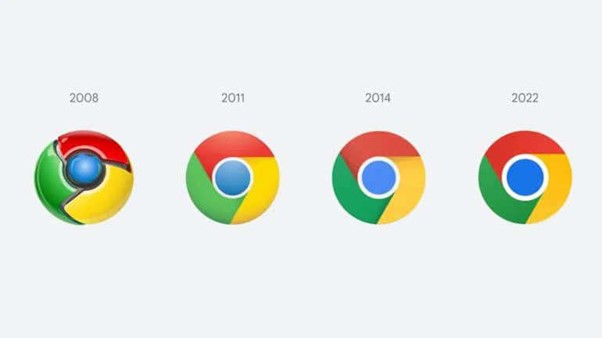
google has made a minor adjustment to the Chrome logo, the first change in eight years after it was given a new look in 2014.
 Career Development
Balancing Life Choices and Defining Success My Way
Success may mean differently for people and its definitions can change over time. For me, the earliest definition of success…
Read More →The circle in the famous logo has gotten a little bigger and a new shade of subtle gradient (that most people won’t even notice) was added to the main icon. This was done to supposedly reduce the friction caused by placing certain shades of green and red, next to each other.
The circle in the famous logo has gotten a little bigger and a new shade of subtle gradient (that most people won’t even notice) was added to the main icon.
 Career Development
Evaluating the Career Value of Online Certificates
This analysis ranks online courses from top providers like Google and AWS based on industry demand and employer recognition.
Read More →